My Mid-century Modern Kitchen Do Over
Designer Rebekah Higgs loves to repurpose and redesign.
If someone told me 2 decades ago that the kitchen would be my favorite room in the house, I would have said, “As if!”, (while watching my favorite movie, Clueless). Back then, hanging out in my bedroom with my girlfriends in tow, talking about our boy troubles while listening to sad tunes, or rummaging through my closet for try-on sessions was how I spent the majority of my time.
Fast forward to being a single mom with a busy 7-year-old daughter, the producer of a TV show featuring our latest renovation and a never-ending list of DIY projects and I can sincerely declare that the kitchen has my heart. Where else can I simultaneously make a grilled cheese sandwich, help Lennon with her homework, and jot down notes on my latest design plan? Did I mention the kitchen/dining room in our new home has the most expansive and breathtaking view of the Bedford Basin? When I say I love my kitchen, I mean….I LOVE my kitchen.
My vision from the very beginning was to design an inviting space that was both functional and stylish. This is the center of our home and that means it needs to work for every member, including @ziggymygirl who has created her very own special nook near the back door. While it’s hard to narrow down my favorite features, there are some that have stood out as fan faves from the very beginning. Interested to know what they are? Keep reading!
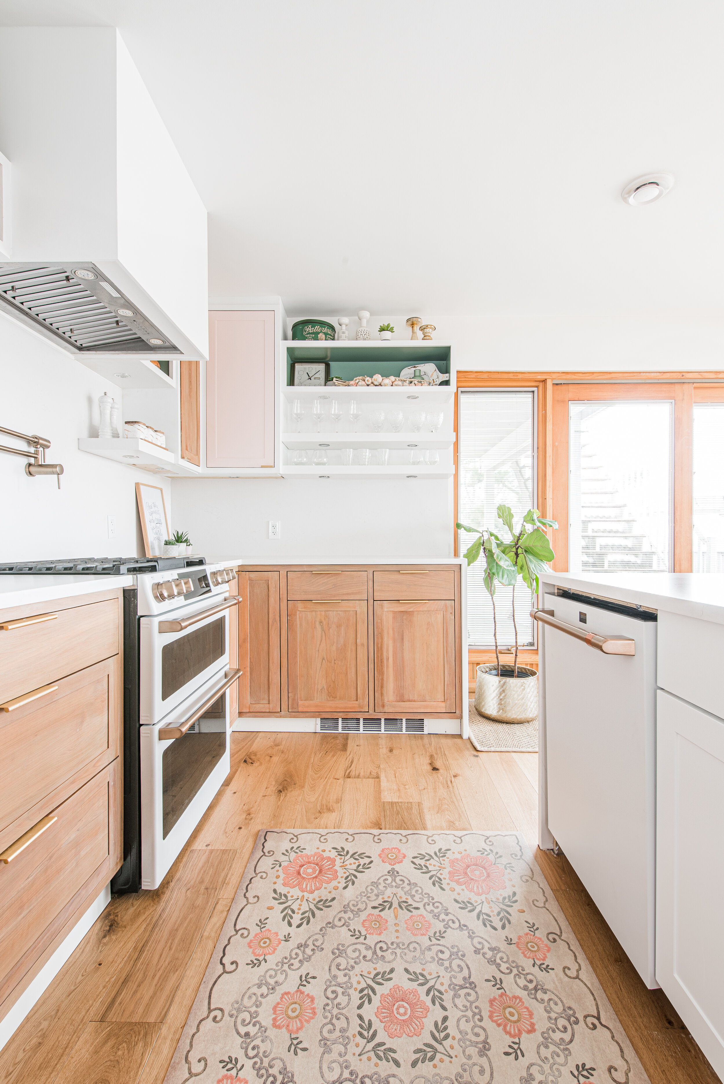
A resilient kitchen counter topped the list of absolute must-haves. The Et Statuario Silestone countertop from Cosentino Canada was such a great selection for our family. The anti-scratch and stain surface means I can cook, plan and work without worry, and the velvety touch of the suede finish elevates the entire look. We used the same material for our backsplash to carry the sophisticated aesthetic seamlessly throughout the space and I’m thrilled with how it all came together.
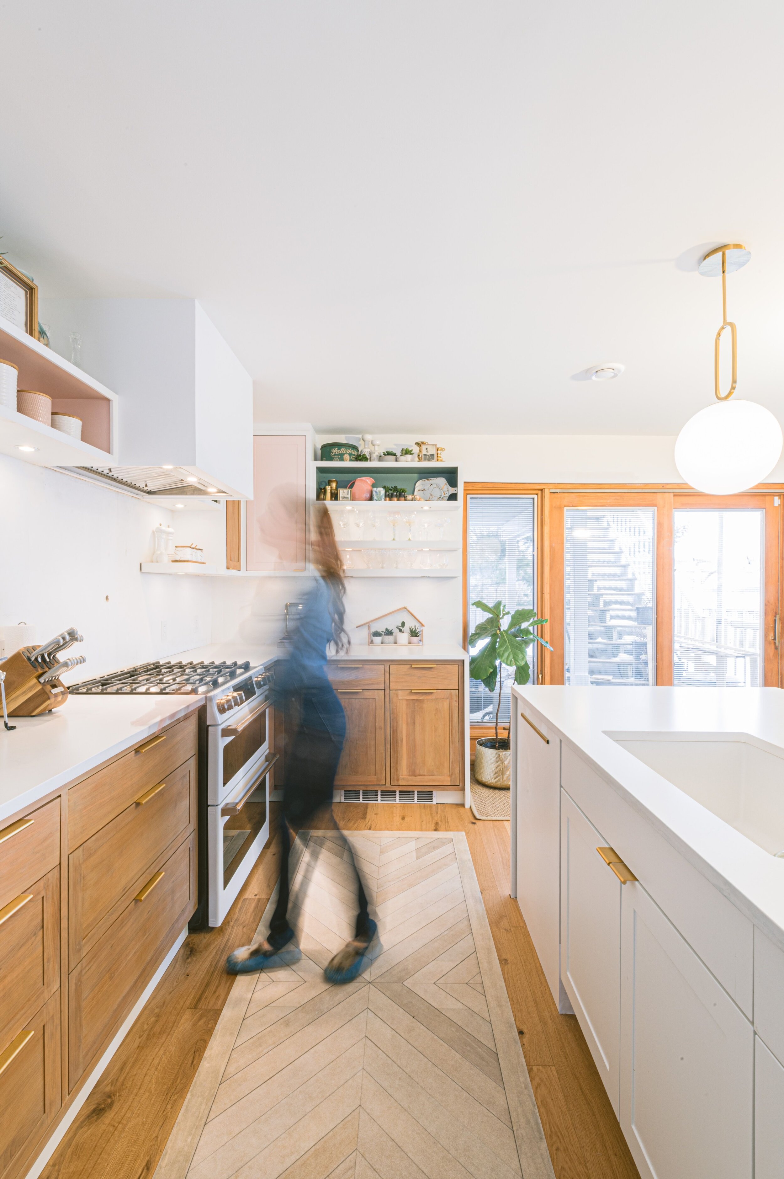
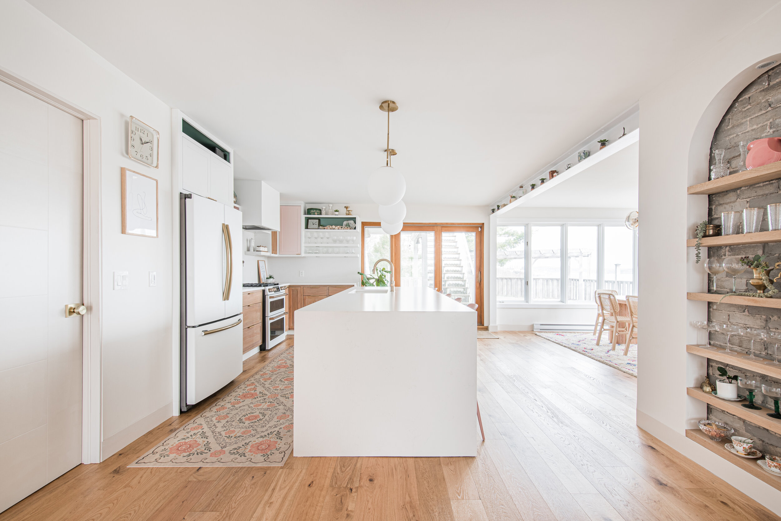
When I saw the 12” round Prospect pendants by Eurofase – blown glass spheres suspended from looped gold metal framework, I knew they were meant for me. This trio sits above my kitchen island and not only provides the perfect ambiance – think lulled, muted light versus bright and blinding, they also add that extra level of urban refinement that takes this entire space up a notch.
My Trinsic Single-Handle Pull-Down Sprayer Kitchen Faucet in Champagne Bronze featuring MagnaTite Docking has been a beautiful addition to this space. The dock keeps the kitchen pull-down spray wand firmly in place with a powerful integrated magnet, so it stays docked when not in use and I love that I can easily remove mineral build-up with the touch of a finger using touch-clean spray holes. It’s worth mentioning, the price point on this little beauty is incredible and the sleek, minimalistic design blends in perfectly with my vibe.
My new Blanco Precis U super sink has come in handy more times than I can count, especially during lockdown when there always seemed to be an influx of dirty dishes to wash. Trust me when I say that the extra large bowl and floating grid will be a kitchen dream come true for that reason alone. It’s easy to clean, non-porous, and heat and scratch-resistant so you never have to think twice about taking extra special care.
A contemporary wall mount pot filler is one of those luxury features you don’t realize you need until…well…you really need it! The Delta pot filler faucet in champagne bronze is a showstopper for several reasons. It’s easy to fill large cooking vessels quickly and without the walk from sink to stove. That may not sound like a big deal, but large water-filled pots can be deceivingly heavy! The dual shut-off valves allow me to turn the water off at either the wall or the spout, which has proven to be incredibly convenient and the beautiful finish adds a touch of old-world charm that makes it irresistible!
I was initially drawn to the pale pink hue and minimalist design of my kitchen island stools, but when I realized how easy it was to wipe and go, I loved them even more. The form-fitting seat makes them ultra comfortable and the contemporary base gives them a sleek, contemporary feel. This design from Wayfair is no longer available, but I’ve linked a similar option here.
One of the biggest showstoppers in my kitchen has to be my Spicer and Co, vinyl floor cloth. In fact, I get asked about it a lot in the run of a day. A high traffic area like the kitchen needs something durable and stain resistant, but I also wanted something comfortable and curated– a nod to my love of vintage style and pink everything. Take it from this DIY mama, if you want something low maintenance without sacrificing beauty, this was made for you.
The coveted Café Appliances in matte white have been in high demand lately and for good reason! The polished finish makes them a designer’s dream, but it’s the added functionality that really sets them apart. My commercial-style range is inspired by professional kitchens and comes with a versatile cooktop that has it all– inspiral and multi-ring burners that evenly heat my cookware, and a caterer’s oven complete with precision cooking modes that make cooking dinners, small or large, a treat.
NDR Auto Solutions came to my rescue in a big way when I found out my refrigerator was on backorder and we were weeks away from filming season 4 of DIY mom. Let’s just say that we couldn’t halt production because of a delayed delivery. The NDR team swooped in with the most genius idea – taking a basic stainless steel refrigerator and wrapping it in white vinyl for a nearly identical finish to my Café Appliances. Confession time: I considered keeping this a secret because the dupe is THAT good, but the premise of my show is learning to find alternatives when things don’t go as planned, and guess what? That’s real life in a nutshell.
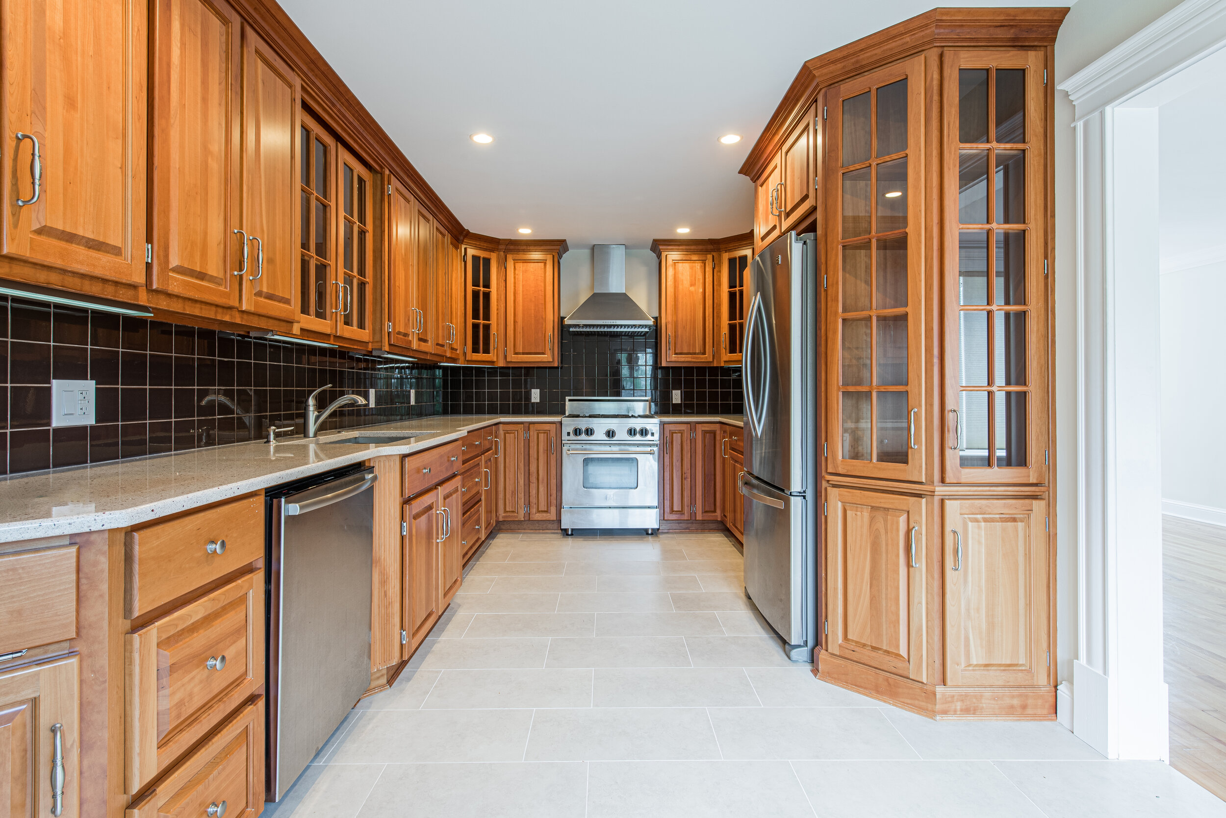
I wanted to repurpose the kitchen cabinets from the original house because they were in great shape and the quality was amazing, so I decided to put a modern spin on an old classic. I flipped and sanded the cabinets with my Ryobi tools and varnish from Home Depot, to give them a shaker style finish, then filled the holes, and moved the entire kitchen from the front of the house to the back for an open-concept design. For the island, I used the pre-assembled Hampton Bay Edison shaker style cabinets from Home Depot and had them color-matched to the kitchen cabinets for a streamlined look and feel. Then we added these pretty Contemporary Aluminium Edge pulls from Richelieu. The entire room received a chic and modern facelift– a brilliant way to create style on a budget.
I love looking back to see how my home has been transformed. What do you think of these before and afters?
Now Go Get it Done - 2021!
xox DIY MOM xox


